Bringing the Outside In | Our Great Room Renovation … per Doug
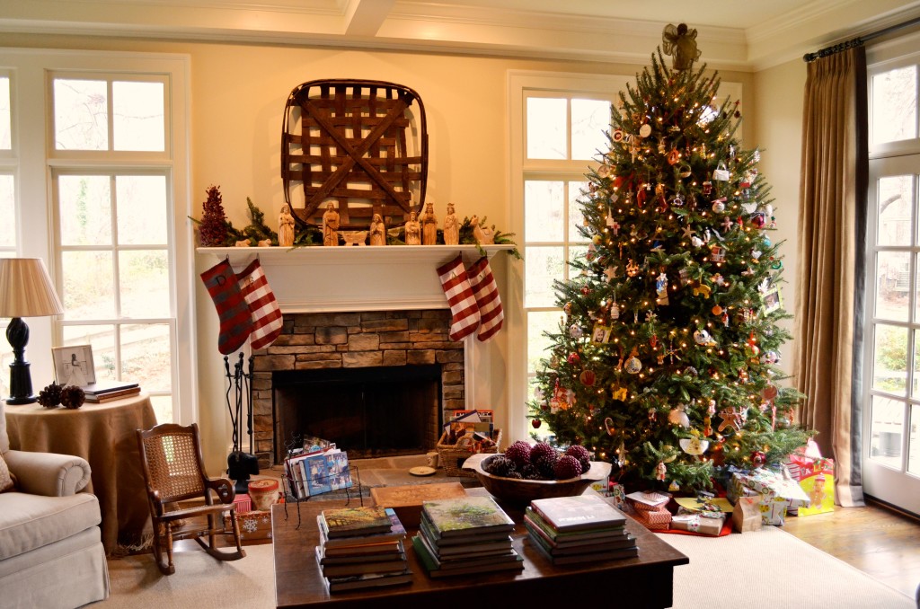
[Lesson learned: Britt and I need to be clearer as to whom is going to write which post – we weren’t when it came to writing about our great room. See Britt’s post below. Since we offered different points of view and some different information, we’re going to go ahead and post them both. You’ll at least get to see what our great room looks like at Christmas.]
When Britt and I decided to renovate our 1963 ranch we each had our own wish list. Britt wanted to have kitchen cabinets whose drawers didn’t leave sawdust in the bowls below, a back door for friends, and a half-bath for guests to use (vs. our girls’ bathroom…which is perhaps the last room we’d want to send a guest). I wanted a den that would give elbow room for more than 6 people at a time…and more importantly, I wanted to give greater visual access to our yard and to have more natural light inside.
1960s ranches are characterized by very small windows, deep eaves…and therefore pretty dark rooms inside. As you can see by the impressive pics below, our house was no exception. Although there was a sliding glass door, it opened to a screened in porch and the only other window was blocked of any sun after about noon. So we really had no natural light…and combined with the lovely dark paneling it felt almost cave-like. (I’m still amazed that Britt trusted in my vision enough to make what you see in the far left picture into what it would eventually become.)
With our wish-list in hand, close friend and incredible architect extraordinaire, Steve Kemp, went to work (kemphallstudio.com). By doubling the size of the room to 26’x19′ and raising the ceiling from 8′ to 10′, what once felt like a depressing cavern became a bright room with all kinds of room. With the exception of the fireplace, the far exterior wall is now entirely windows and trim – giving the impression that you’re sitting in the middle of our back yard. On the wall to the right is a set of french doors giving access to the back patio and on the wall to the left is another window (not shown) providing more morning light.
We further blended the outside in by some of our design choices:
- The walls are painted a very light neutral (Manchester Tan, Benjamin Moore #HC-81) and the trim around the mantel/surround, windows, coffered ceiling, and ceiling itself were all painted a creamy white (Acadia White, Benjamin Moore #AC-41). The colors, being very similar, allow the eye to keep going out or up – adding to a sense of greater volume.
- Britt had purchased an old tobacco basket before we got married at Scott’s Antique Market that I simply cleaned up and rubbed on some dark stain I had from a previous project. We love how it provides a nice contrast to the light walls and strong visual interest without being too fussy.
- The hearth is made of some extra crab orchard flagstone I’ve used for paths throughout the backyard and the surround is made of faux stone picked to match. This further ties our indoor and outdoor spaces together. Minimizing the number of materials makes for a more cohesive and less cluttered feel throughout our home and landscape.
- Since we don’t have a privacy issue in our backyard, we chose not to put curtains along the back wall (despite my mother-in-law’s wailings) and only installed them at the french doors to occasionally block out the bright afternoon glare. This maximized the amount of natural light we get throughout the day, while giving complete visual access to see whatever is going on in our backyard.
- For the curtains we chose burlap block-out panels with a 3′ chocolate brown band of linen. The burlap was not only cheaper than the other options we considered, it also provides a richer texture that mimics some of the other elements we have going on. The linen band not only provides a nice finishing touch, functionally it also gives us something to grab when opening and closing the curtains.
- The few accessories we have were literally found in our yard or seem to have lived a life before we found them…all lending themselves to a certain degree of familiarity and meaning.

We couldn’t be more pleased with how our great room turned out. Not only do we enjoy it as a family, we’re now able to have more people over at once to enjoy it with us. By blending our inside and outside spaces we’ve been able to give a greater sense of grounding…that I think ultimately provides a warmer, more welcoming space. Which is exactly what we want our home to be. We’ll write more about how we intentionally considered the exterior when making other interior decisions for our renovation in future posts.
What have you done to blend your interior living spaces with the outside?
We look forward to hearing from you and sharing your story with others.
You may also enjoy these posts from RYG ...
If you're not already subscribed to RYG and want to get periodic updates, links to new posts & other ground redeeming info ... just enter your email address below. Easy as that!


